Last week the UK government published the latest version of the Digest of UK Energy Statistics (DUKES). These are annual National Statistics that describe how the UK is producing and consuming energy.
There’s lots in there which I’m still reading. But one diagram in particular has caught my attention.
Energy Flow Chart 2022
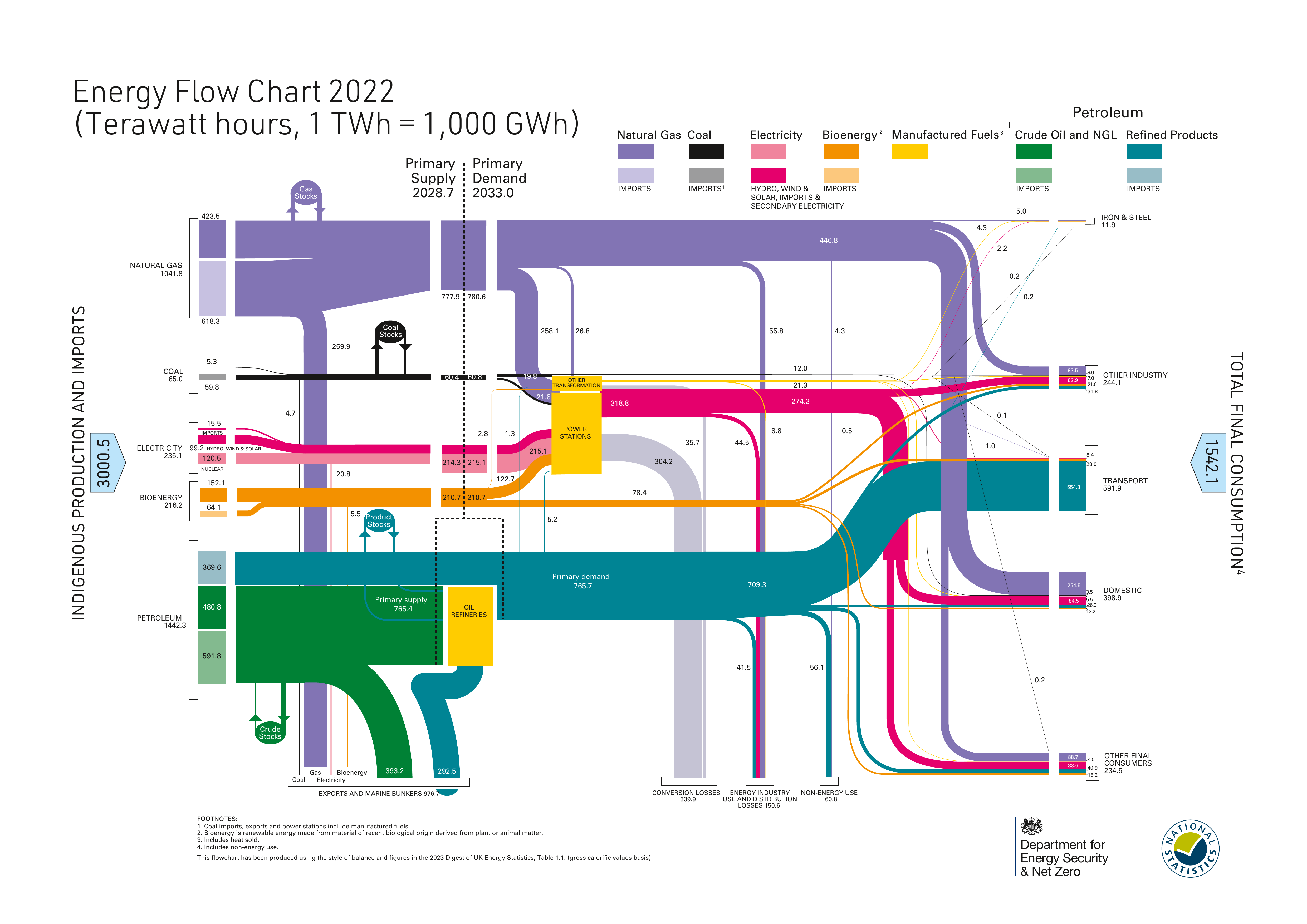
The diagram shows the flow of energy from production or imports through until their primary uses.
Different types of energy source are colour coded. E.g. gas is purple, petroleum green/blue, and electricity red. Imports are differentiated from energy produced in the UK through a variant colour. The size of the flows are proportional to the amount of energy.
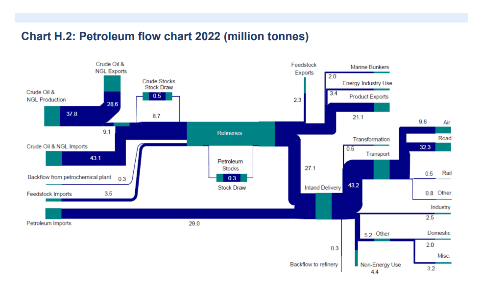
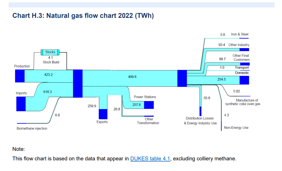
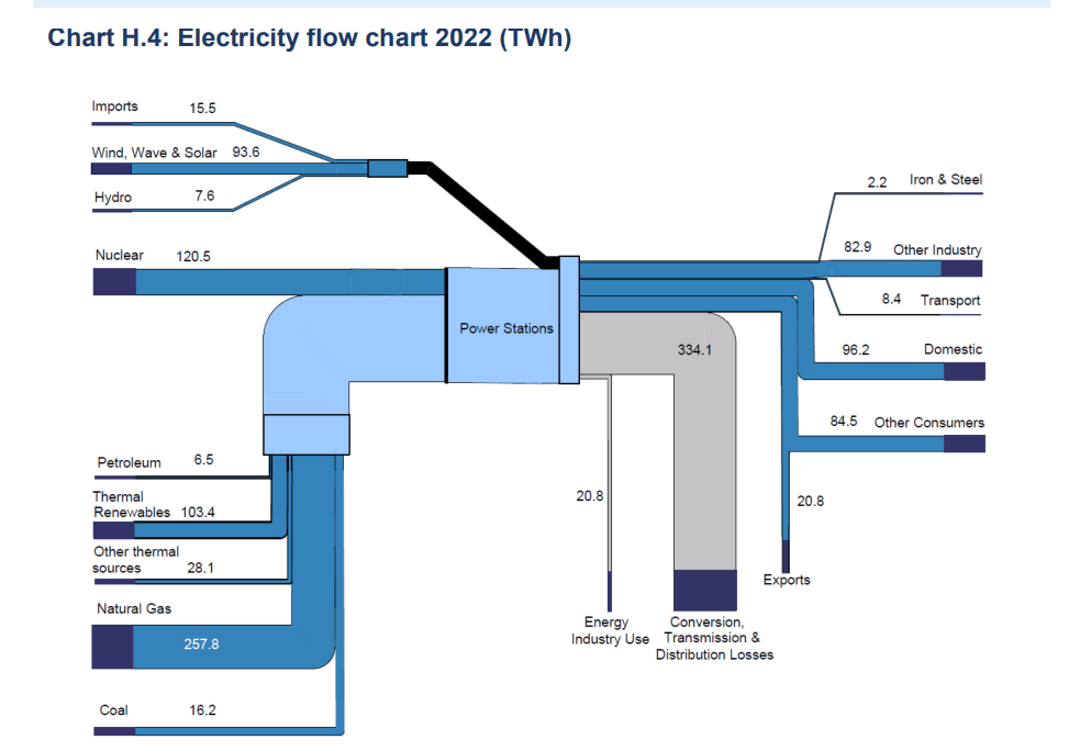
The diagram is a summary of some more detailed flows that are mapped out in Annex H of the statistics. The more detailed diagrams cover Petroleum, Natural Gas, Electricity, Renewables, Solid Fuels and Coal. I’ve extracted a few of them below.
They’re naturally more complex but unfortunately don’t share the same colour coding. (Although as there are so many types of renewable energy source, this might be tricky to do).
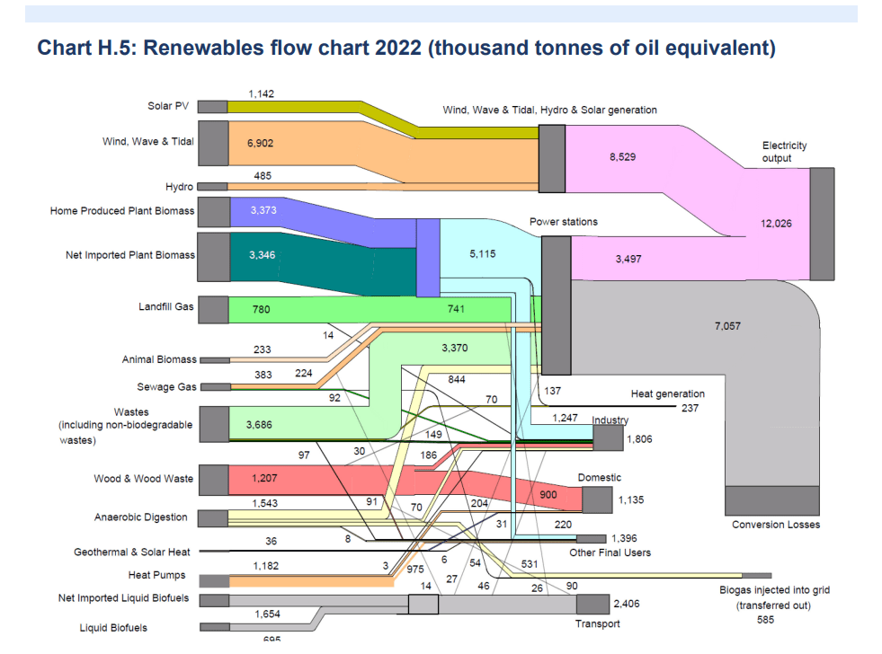
As a systems thinker I appreciate just how well these diagrams quickly provide a useful overview.
Levers for impacting flows
Looking at the main diagram, for example, we can easily see that the main use of Petroleum products is in the transport sector. And the main users of Gas are power stations, where it is used to produce electricity, and domestic use to heat our homes.
These might be obvious. But the flows give a clear indication, shorn of any particular policy or politics, about the scale of the changes we need to make to decarbonise our energy system. And exactly where those impacts will be felt.
I think it’s kind of refreshing to see something laid out like this.
If we want to reduce the size of flows in specific areas, then our levers mainly boil down to:
- decreasing demand by reducing unnecessary consumption, or encouraging behaviour change
- increasing efficiency so we get more for less from existing flows
- shifting consumption to another area
For transport, this looks like: more use of public transport or bikes; development of shared delivery infrastructure for commercial use; discouraging short trips; encouraging and enabling adoption of electric vehicles, etc.
For gas, this looks like: investing significantly in improving existing home insulation (domestic boilers are already 90% efficient); increasing the mix of hydrogen in our gas networks; installation of heat pumps where feasible; etc.
Looking at electricity there’s a considerable loss from the conversion of other sources of energy to electricity, as well as network distribution losses. More renewables and more local generation will help reduce that. As will energy storage to let us reduce the need to use gas when renewable generation is lower.
No single approach, or new technology — short of unlimited clean energy — will deliver those changes. Innovation won’t save us here: we need serious, sustained investment in options that will have impacts across these energy flows as soon as possible.
Energy independence?
I think the diagram also makes it clear that a policy to make the UK more energy independent — to “power Britain from Britain” to quote Sunak — is actually one of decarbonisation.
Increasing the production of Gas and Petroleum will not impact consumption patterns. And neither does it give us more resilience.
We don’t really import Gas and Petroleum from “foreign dictators”. We mostly import from Norway and the US. We do export a lot of Gas and Petroleum. Because we don’t have the domestic gas storage, or refining capacity, to do anything else with it. But there’s also profits to be had from international sales.
If you were serious about increasing energy independence you’d focus on reducing demand, because that’s the long term requirement. We then need to import less.
If reducing demand will take too long, then reducing exports in favour of local consumption (shifting flows) would be the other option. But that would impact profits.
