
This blog post is basically a mood board showing some examples of how people are mapping data ecosystems. I wanted to record a few examples and highlight some of the design decisions that goes into creating a map.
A data ecosystem consists of data infrastructure, and the people, communities and organisations that benefit from the value created by it. A map of that data ecosystem can help illustrate how data and value is created and shared amongst those different actors.
The ODI has published a range of tools and guidance on ecosystem mapping. Data ecosystem mapping is one of several approaches that are being used to help people design and plan data initiatives. A recent ODI report looks at these “data landscaping” tools with some useful references to other examples.
The Flow of My Voice
Joseph Wilk‘s “The Flow of My Voice” is highlights the many different steps through which his voice travels before being stored and served from a YouTube channel, and transcribed for others to read.

The emphasis here is on exhaustively mapping each step, with a representation of the processing at each stage. The text notes which organisation owns the infrastructure at each stage. The intent here is to help to highlight the loss of control over data as it passes through complex interconnected infrastructures. This means a lot of detail.
Data Archeogram: mapping the datafication of work
Armelle Skatulski has produced a “Data Archeogram” that highlights the complex range of data flows and data infrastructure that are increasingly being used to monitor people in the workplace. Starting from various workplace and personal data collection tools, it rapidly expands out to show a wide variety of different systems and uses of data.
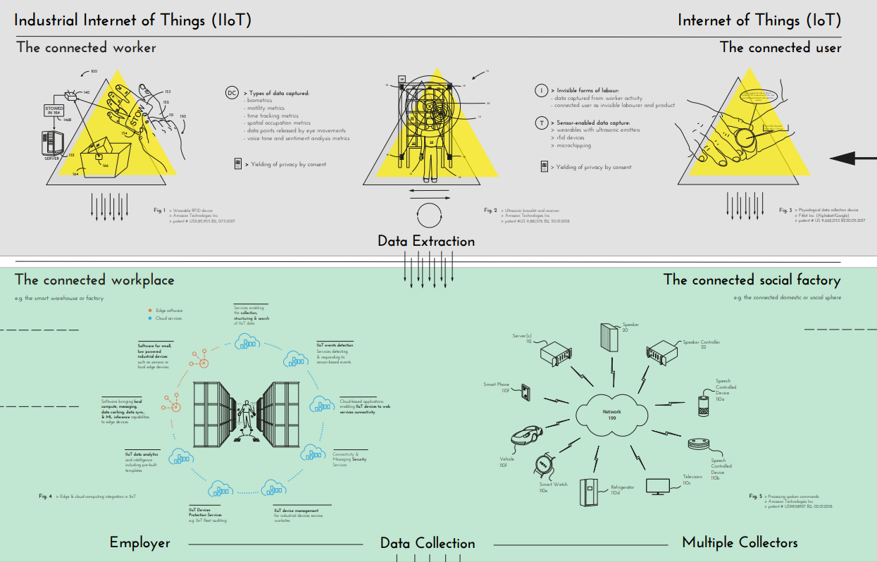
Similar to Wilk’s map this diagram is intended to help promote critical review and discussion about how this data is being accessed, used and shared. But it necessarily sacrifices detail around individual flows in an attempt to map out a much larger space. I think the use of patent diagrams to add some detail is a nice touch.
Retail and EdTech data flows
The Future of Privacy Forum recently published some simple data ecosystem maps to illustrate local and global data flows using the Retail and EdTech sectors as examples.

These maps are intended to help highlight the complexity of real world data flows, to help policy makers understand the range of systems and jurisdictions that are involved in sharing and storing personal data.
Because these maps are intended to highlight cross-border flows of data they are presented as if they were an actual map of routes between different countries and territories. This is something that is less evident in the previous examples. These diagrams aren’t showing any specific system and illustrate a typical, but simplified data flow.
They emphasise the actors and flows of different types of data in a geographical context.
Data privacy project: Surfing the web from a library computer terminal
The Data Privacy Project “teaches NYC library staff how information travels and is shared online, what risks users commonly encounter online, and how libraries can better protect patron privacy“. As part of their training materials they have produced a simple ecosystem map and some supporting illustrations to help describe the flow of data that happens when someone is surfing the web in a library.

Again, the map shows a typical rather than a real-world system. Its useful to contrast this with the first example which is much more detailed by comparison. For an educational tool, a more summarised view is better to help building understanding.
The choice of which actors are shown also reflects its intended use. It highlights web hosts, ISPs and advertising networks, but has less to say about the organisations whose websites are being used and how they might use data they collect.
Agronomy projects
This ecosystem map, which I produced for a project we did at the ODI, has a similar intended use.
It provides a summary of a typical data ecosystem we observed around some Gates Foundation funded agronomy projects. The map is intended as a discussion and educational tool to help Programme Officers reflect on the ecosystem within which their programmes are embedded.

This map uses features of Kumu to encourage exploration, providing summaries for each of the different actors in the map. This makes it more dynamic than the previous examples.
Following the methodology we were developing at the ODI it also tries to highlight different types of value exchange: not just data, but also funding, insights, code, etc. These were important inputs and outputs to these programmes.
OpenStreetMap Ecosystem
In contrast to most of the earlier examples, this partial map of the OSM ecosystem tries to show a real-world ecosystem. It would be impossible to properly map the full OSM ecosystem so this is inevitably incomplete and increasingly out of date.

The decision about what detail to include was driven by the goals of the project. The intent was to try and illustrate some of the richness of the ecosystem whilst highlighting how a number of major commercial organisations were participants in that ecosystem. This was not evident to many people until recently.
The map mixes together broad categories of actors, e.g. “End Users” and “Contributor Community” alongside individual commercial companies and real-world applications. The level of detail is therefore varied across the map.
Governance design patterns
The final example comes from this Sage Bionetworks paper. The paper describes a number of design patterns for governing the sharing of data. It includes diagrams of some general patterns as well as real-world applications.
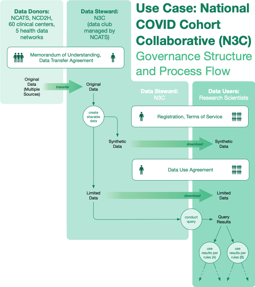
The diagrams shows relatively simple data flows, but they are drawn differently to some of the previous examples. Here the individual actors aren’t directly shown as the endpoints of those data flows. Instead, the data stewards, users and donors are depicted as areas on the map. This is to help emphasise where data is crossing governance boundaries and its use informed by different rules and agreements. Those agreements are also highlighted on the map.
Like the Future of Privacy ecosystem maps, the design is being used to help communicate some important aspects of the ecosystem.
